This is simply astonishing. It'd be a big enough undertaking as a single cover but as a wraparound!?! Wow! As if any more proof were needed of Mr Brooker's exceptional work ethic, check out this article in his brilliant blog where he discusses the 'Sharkitecture' of the hidden city, it's amazing!
Over to Matt to tell us more in 5... 4... 3... 2... 1... Blast off!
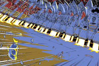
"01-03 - Roughs sent to Matt Smith. He’d suggested something around the take-off of the God City from the end of the previous episode. I did two versions of this idea (close-up on Frank and pulled back to show the scale of the city), plus an alternate idea (a parody of the Jaws poster). Matt liked the “scale” version of the city take-off and asked me to turn it into a wraparound cover for even more impact. We took this forward without any more roughs."
01 - Hot Grot!
02 - The chosen one...
03 - Sharkbah! I LOVED this cover too...
With the cover chosen by the Mighty One, the hard work begins. Matt continues "04 - in Manga Studio, I pasted the rough into a double-page file (one of the few features Manga Studio lacks is the ability to change page size; back when I was drawing in Illustrator I’d have just doubled-up the page dimensions of the file I’d drawn the roughs in). The only change made to the original composition is to rotate it a bit so the city doesn’t drift off the top of the back page. I build a perspective grid round the rough using Manga Studio’s Perspective Rulers feature and do a rough drawing that extends the city across the back page. I add the damaged taxi, buffeted by the blast from the city’s take-off, as a point of interest on the back page."
04 - Find Frank! I challenge you to find Frank before moving on...
"05 - Pencils. The rough pencils give me a good enough guide for the buildings, so I concentrate the more precise drawing of the finished pencils on the figure of Frank, the taxi, and establishing a line of shadows that will fall across the frame (I do also add a few extra buildings top right of the back page)."
05 - More buildings!?!
"06 - Inks. Manga Studio’s pen tools are the closest thing I’ve ever used to a proper dip pen (and a good one at that). The pen tool can be constrained to draw along the perspective lines, which is how I did the manga-style whoosh lines at the edges of the drawing. Otherwise I ink everything freehand; I like my drawings to look hand-drawn. Coloured lines (the blast from the engines) are drawn on a separate layer from the black."
"06 - I hope Franks legs don't break, walking on the moon!"
"07 - Inks shown without the pencils and perspective grid, but with solid blacks added."
07 - The blackness of space.
"08 - Flat colours. With a complex drawing like this one you want to keep the colours as simple as possible, otherwise you just end up with an unreadabe jumble o’ stuff. I’m trying to keep it to big areas of simple colour that help define what you’re looking at; the lunar surface, the flames, the dirt-encrusted base of the city, the flanks with their exposed mechanisms, the finished, cladded buildings above."
08 - Flats amazing!
09 - Wow, the rimlights add so much. Try flicking back and forth between images 08&09 to get the effect of the fire!
"10 - Light and shade. On another new layer I pretty much colour the whole thing again, this time looking at light and shade; everything in shadow is blue, the lit areas are pale yellow. Now I export the file to Photoshop, where I can start overlaying and merging these different layers to create a full-colour image with shading."
10 - Let there be light!
11 - The fire from those boosters really starts to look fierce now...
"In this case, I treat the yellow as the brightest highlights from the sun, and use the layer mask to fade down the colour where I don’t want it to be so intense. I use a home-made brush with captured sponge-texture to give me textured shading that matches the gritty lunar surface."
12 - The layer mask having a startling effect on the highlights here.
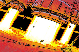
"12a - I’ve also brightened up the flames from the engines - to get an effect of intense light, I stroke in white using the Pencil Tool, which gives me hard-edged, uniformly opaque strokes. I do want a bit of blending where the jets hit the ground, so there I use my own variant of Photoshop’s supplied maple-leaf pattern Brush - the hard triangular edges of the leaves convey crackling flame quite well.
A lot of people think you need soft edges and gradations to portray fire, but actually a combination of very hard edges and colour contrast work better. A little soft brushwork or gradation to add a glow does enhance the effect, but it’s the icing on the cake."
12a - Blast off!
13 - Blue moon.
"14 - My usual formula for shadows is to reduce the layer opacity to 50% and to change the Blending Mode to Multiply - this gives the effect of adding a wash of transparent ink (the colours underneath show through and are darkened, This looks a bit strong to me - let’s see what it looks like against the bright highlights..."
14 - The D'Israeli formula for shadows.
15 - Too much contrast?
"16 - With the shadow layer set to Normal blending mode but still at 50% opacity, the underlying colours aren’t darkened so much, though the contrast between light and shadow is clear. This would be a bit bland on its own, but I’m going to do some more work."
16 - Almost there...
"17 - I select all of the shadow areas (because they’re the only thing on that layer, I can use Select: Load Selection: Layer Transparency to pick them out in one go). Making a new layer, I paint red highlights into the shadow areas around the booster flames using the sponge-texture Brush from step 12. I also darken the tips of the shadows with a deeper blue. I add orange highlights on the ground around the booster flames using the maple leaf Brush from step 12a.
Corel Painter would seem to be the ideal application to handle this sort of texture work, but this sort of large file (132mb on disk, 700mb in RAM) would just make it grind to a standstill. Quicker and easier to fake it in Photoshop."
17 - Red alert!
18 - Close-up showing the texture effects. Using these textures brushes takes a little longer than using simple gradations, but it helps give the work a bit more life and individuality."
18 - Maaaan, that looks hot!
19 - At this point, we’re done; save a copy, flatten layers, convert to CMYK, upload to the 2000AD server, send in the invoice!
19 - The stunning cover in all it's glory!
So there we have it, another masterclass by the undisputed king of grot, D'Israeli. I've genuinely ran out of superlatives for this cover and the work of D'Israeli in general. The man is clearly a genius at the top of his game, long may he work for the galaxy's greatest comic!
Thank you so much to Mr Brooker for taking the time and energy for giving us yet another fascinating glimpse into his work.


.jpg)
.jpg)


.jpg)


I absolutely adore this image, and this post is a great insight into the process that went into making it.
ReplyDeleteThat Pete, THAT is how you do a blog. Thanks so much for that, chief.
ReplyDeleteI've said it before and I'll say it again: D'Israeli's a National Treasure, and not the kind that needs locking up. He always seems to go that extra mile with his artwork, and his posts here and on his own blog are endlessly fascinating, so thanks for getting these out there, Pete!
ReplyDeleteAwesome post!
ReplyDelete